This dev log is dedicated to the progress and contributions on my side of things in the development process for the chosen prototype “Artic Exodus”, the prototype that we ended up going with as our mainline game that we would be focusing all of our efforts into.
It was decided early on into the development cycle of the game, that we would divide the tasks across several weeks, as so that things could be kept organised.
As of May 9th 2023 at 4:11am, the final build was released for us to hand in for the assignment. The link for the build can be found just below this message. (if it does not work, do contact either myself or other members of the team).
https://1drv.ms/u/s!Al3KP5E414G-gcMnVbUy3EwGKSLWiA?e=cazdIg
Week 1 – Sprites & assets
The first week of work, we were each given a list of what was needed to be done for the game. I was given this list from the trello board for both high priority assets, and low priority assets.
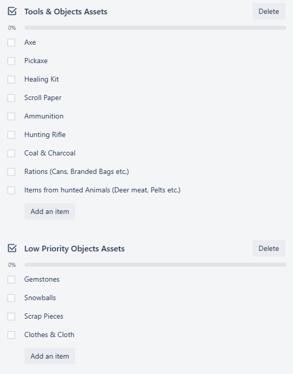
Seeing the list ahead, I asked within the discord group chat if they had any particular visual design in mind for these assets, or if they would just accept any. This was the response I was given for that question.
With this information, I took the reference images I was given, and began work straight away.
Since they did state that a cartoonish-like art style is what their looking for, I could somewhat easily incorporate how I normally draw, as well as into my art program of preference, being MSPaint, into these graphic designs, with the only major change being the lack of coloured outlines.
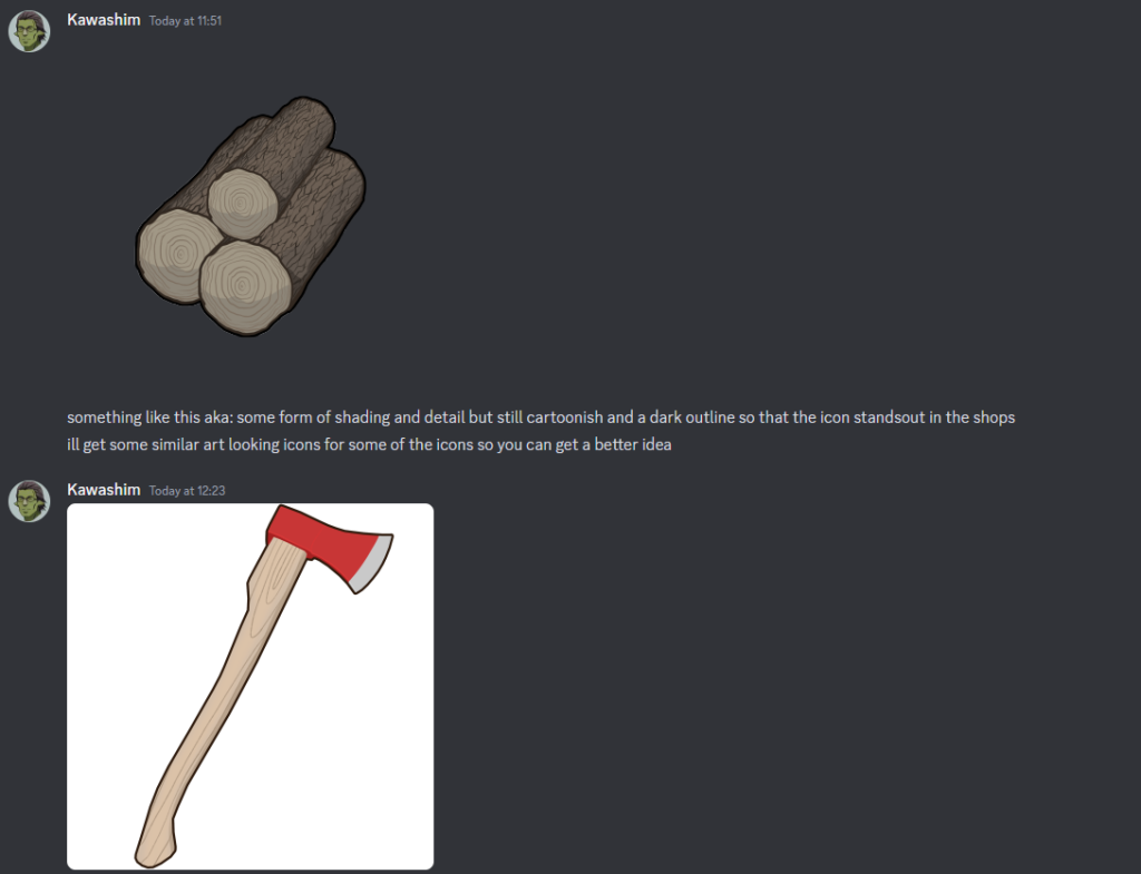
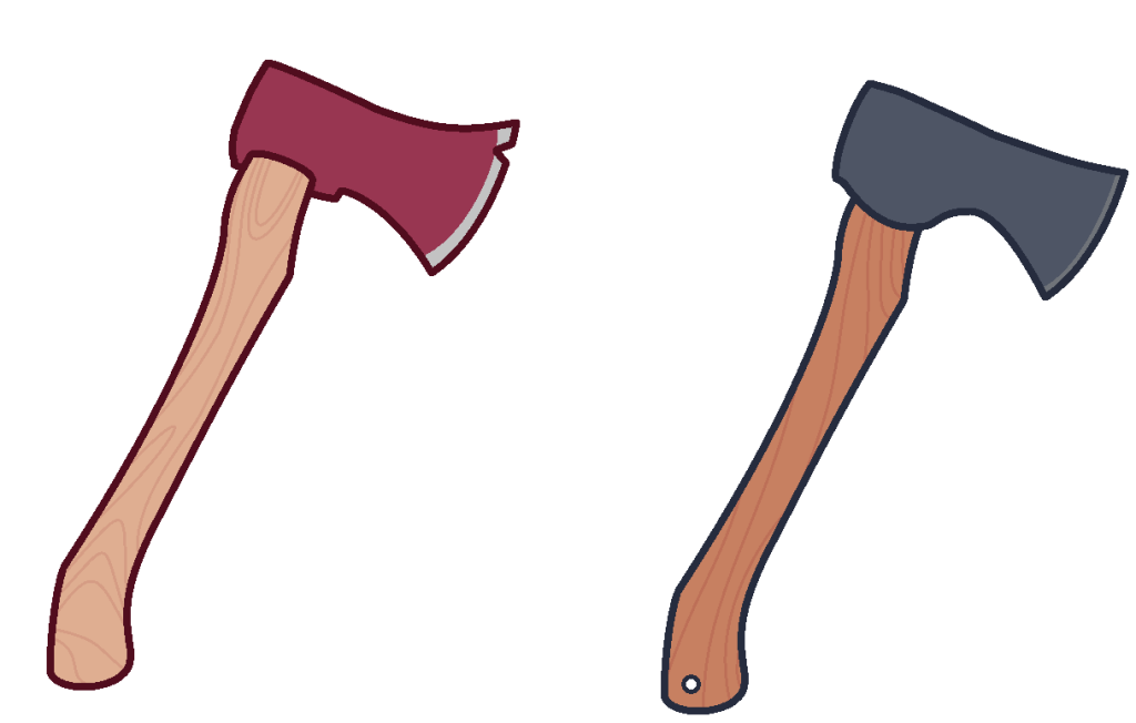
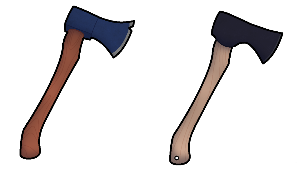
I first started with the axe, by taking the image that the team had provided, and make some very rough changes to it, to get the proportions to look roughly how I wanted them to be like.
This was mainly to stick to the source material provided, whilst adding in a few of my own details to the sprite as to give it it’s own unique flavour. This flavour would come before the outline of the axe was done when I decided to have a search of hunting axes, given the games main focus on survival, and after a few minutes of searching, happened to come across a design that I think would fit.
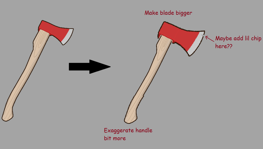
This design choice would be implemented as a separate variant to the axe design so that it can be sent over to the team for later analysis, as to get their general opinions on both variants.
After some minor design tweaks, and some changes to the colours, these two variations were what I conjured up with to send to the team for initial thoughts.
After a few hours, the team finally responded with the following statement.
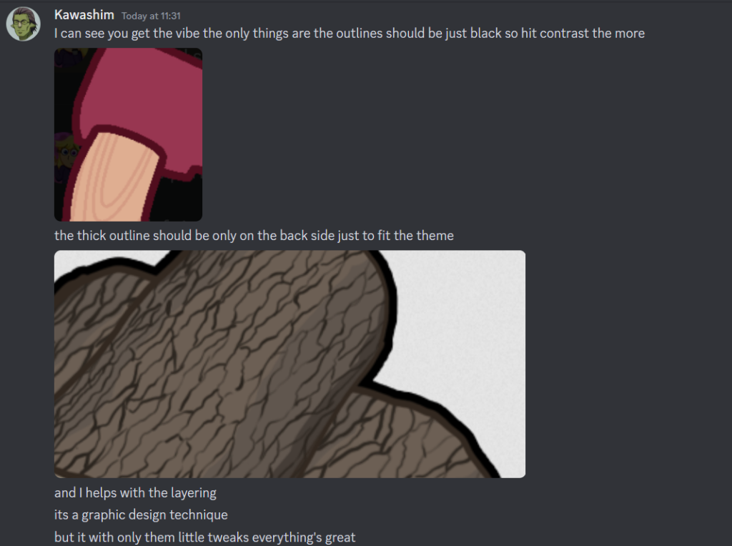
The teams comments were mostly positive, only suggesting a few mild changes in terms of the outline, but were happy to accept both variants of the axes. Happy with the feedback, I went back into MS Paint, and began to implement these changes for both variants straight away, changing the thick outline to black, as well as adding in a few smaller details before taking it into Paint.net to add in the finer details. After a few minutes of tinkering with the layer information, making sure that each layer applied an appropriate amount of detail, this was the result that I ended up getting.
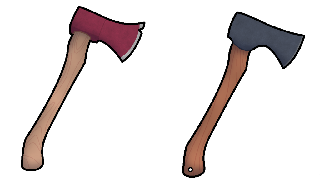
The design composed of 3 different layers that add in detail for the axe graphics. The base template, which hosts all of the base information and colour pallet, the shade layer which contains the shadows for each of the axes, and the detail layer, which adds the general details for both of the axes, and gives them that general weathered appearance. This was done with a surprisingly simple method in Paint.net, where the render clouds tool was used, and then made with transparent black colours to grant it a more weathered like appearance. In a sense, it allowed for applying great amounts of detail with little effort in a sense, by using a tool specifically for clouds in an unexpected way. This would be something that I would use for a lot of the assets later down the line.
I then sent over the designs to the team to see how they find them. Moments later I was greeted with this response.
Like stated in the discord group chat, this could be easily done since the base colours are on a separate layer, and as such, decided to experiment with the colours on the axes.
I decided to make these alternate colour’s for them just in case for each of the axes just in case that the base colours are something that are not to their liking.
With the axe done, it was now time to move onto the pickaxe. This would be relatively easy to make, since I could easily just reuse the stick part of the axe, but just slapped onto the pickaxe with minor alterations, though I eventually decided against this, and just chose to give a unique stick design of its own in the end. Once again, a variant of the pickaxe would be created alongside the base one to see the teams thoughts on it.
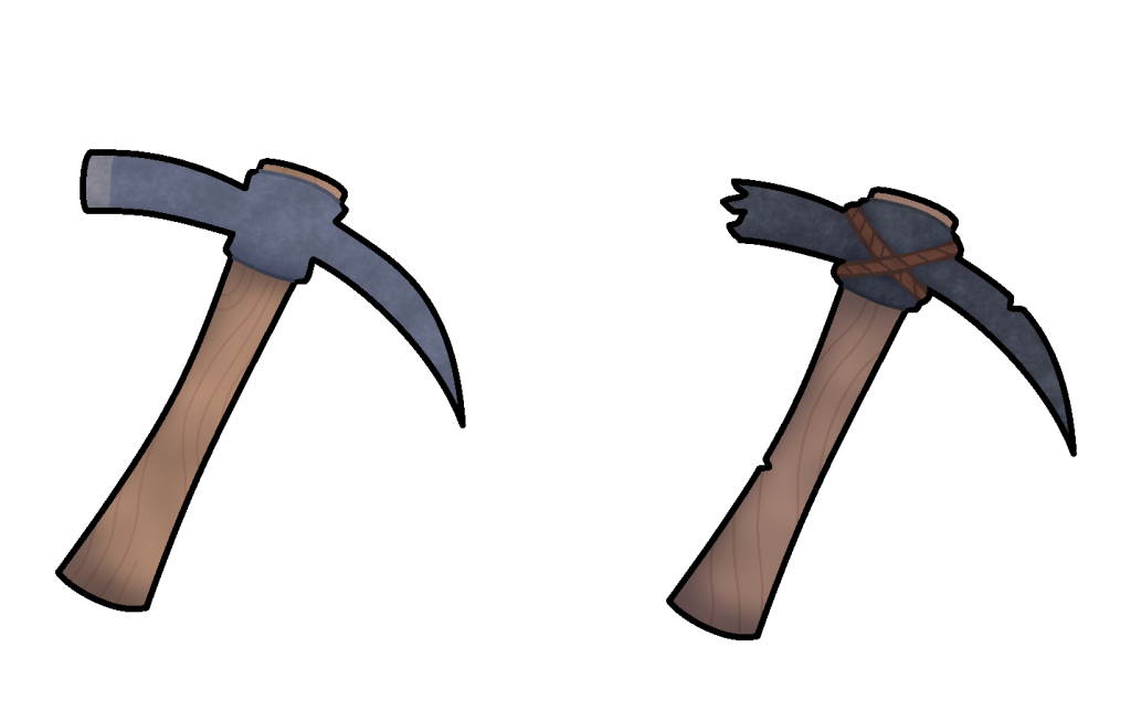
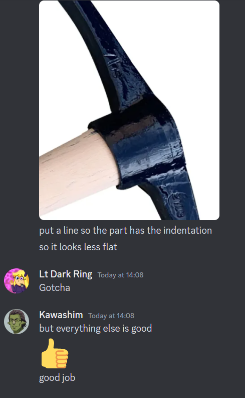
The designs were then sent off to the team, and their thoughts were then awaited for. The response was mostly positive, though they did suggest adding a line around the parts that stuck out on the metal part of the pickaxe, as to make it not look as flat.
These faults were then corrected and then the design’s were handed back in for the team to use.
Next came the medkit in terms of designing graphics. Since the game was based entirely around survival, I decided to give the medkit a sort of a simplistic design, to make it easier to identify amongst the other assets within, both with its standard version as well as the variant for just in case.
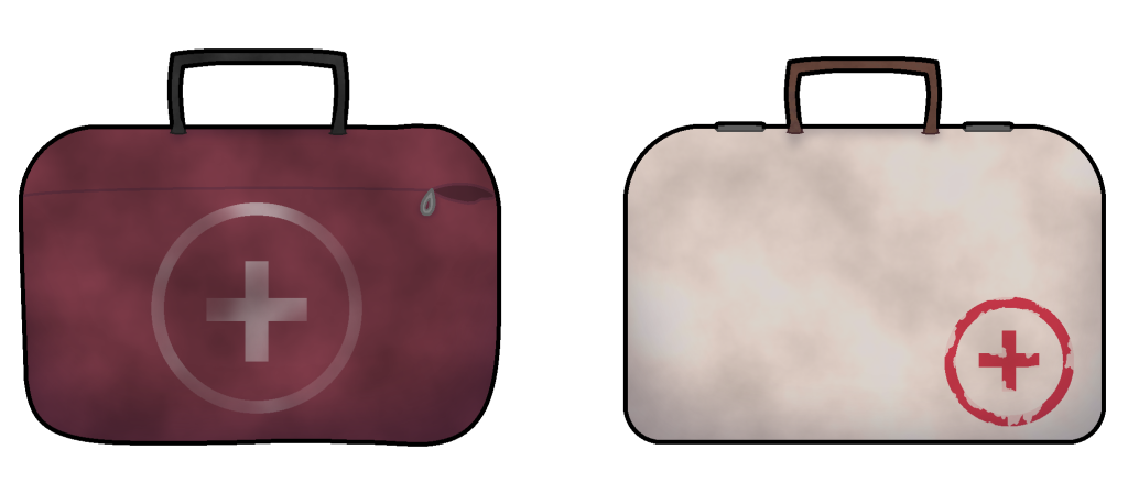
Whilst the team were happy with the initial designs handed in, they did state the following.
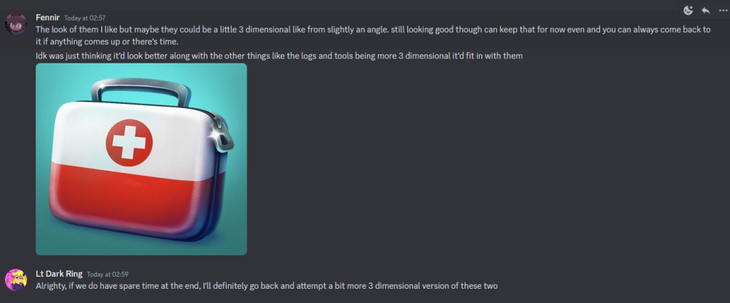
This was something that I could agree with, especially since it is quite common in games for a medkit (or rather any form of medical related item thingy)to have a slight amount of 3D like most other in game. Though they did collective decide that the designs would be accepted for now, but if we had any spare time at the end of the development process, then we would go back, and give the medkits a more dimensional design.
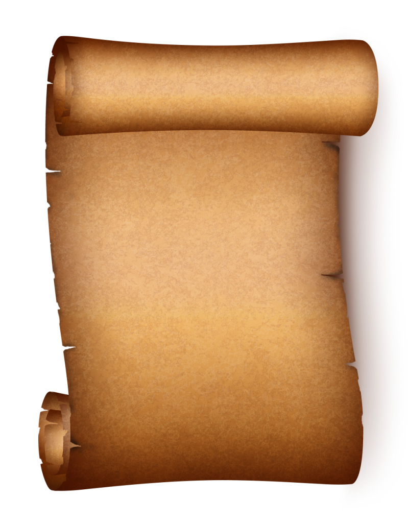
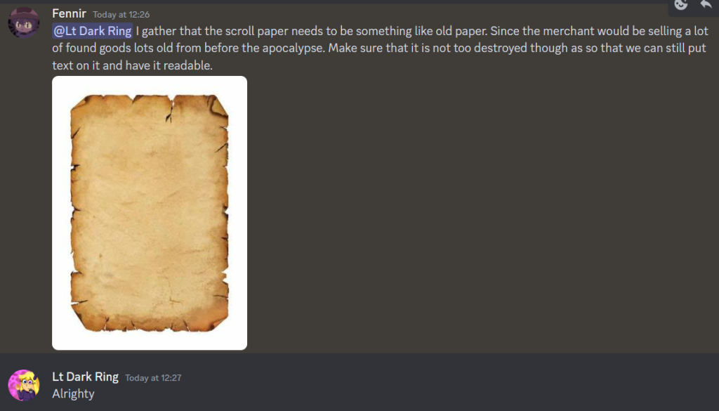
Next on the list of items to create sprites for, would be that of scroll paper. Since the list didn’t have any form of description for a specific design they were looking for, I once again decided to interpret and conjure up 2 designs once more, though since I was unfamiliar with the object in question, I decided to grab a reference image once again so that I could get a rough sense as to what the object looked like, using this reference image.
Though I still decided to ask the team for a reference just in case if this was the wrong type, and that they had a specific design in mind. Though due to a lack of a response, I decided to move onto the next sprite until a response was provided, that being ammunition.
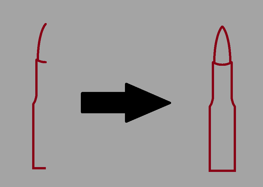
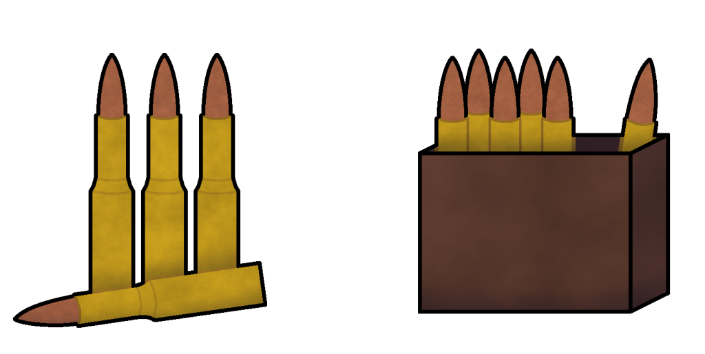
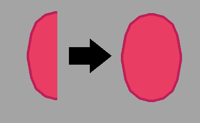
With ammunition being a bunch of relatively small objects, rather than something large, I decided to go for a rather simple design of a large bullet, keeping it relatively simplistic since the object in question would be rather small. The design process would also be simplified by designing half the bullet first, and then when the design was how I wanted it to look, it would be copied and then flipped over to make the whole complete object.
With the base bullet now complete, I could replicate it as many times as needed to conjure up enough to use for both the normal design, and it’s variant, which were kept relatively simple this time round. The designs were then completed and then sent over to the team for review. After a short wait, this was the response that I was given.
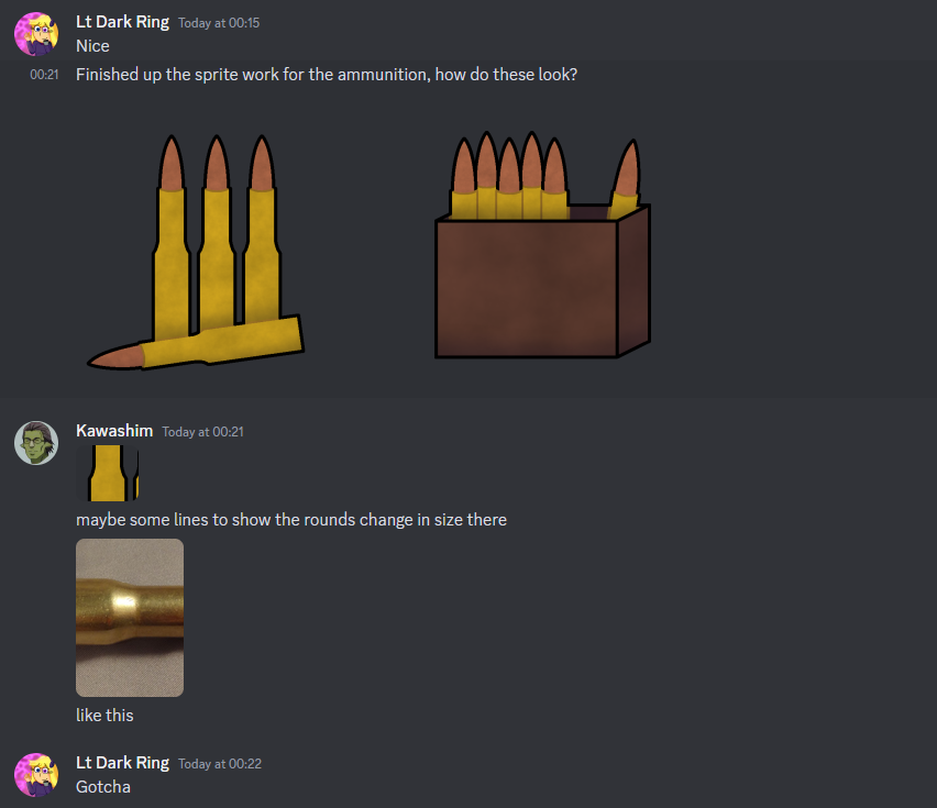
They requested a quick change to the design where the bullets along the middle area, should have some lines to show the bullets changing in size. This change was quickly added, and then the designs were handed back in for the team to use for the game.
Next came the hunting rifle. Interestingly enough, a reference image was not needed to be searched for, since the day before, one of the team members had posted their 3D model of the hunting rifle that was to be used for the game.
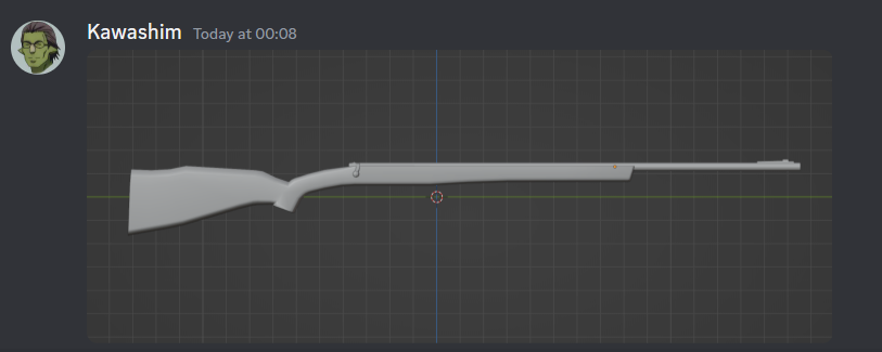
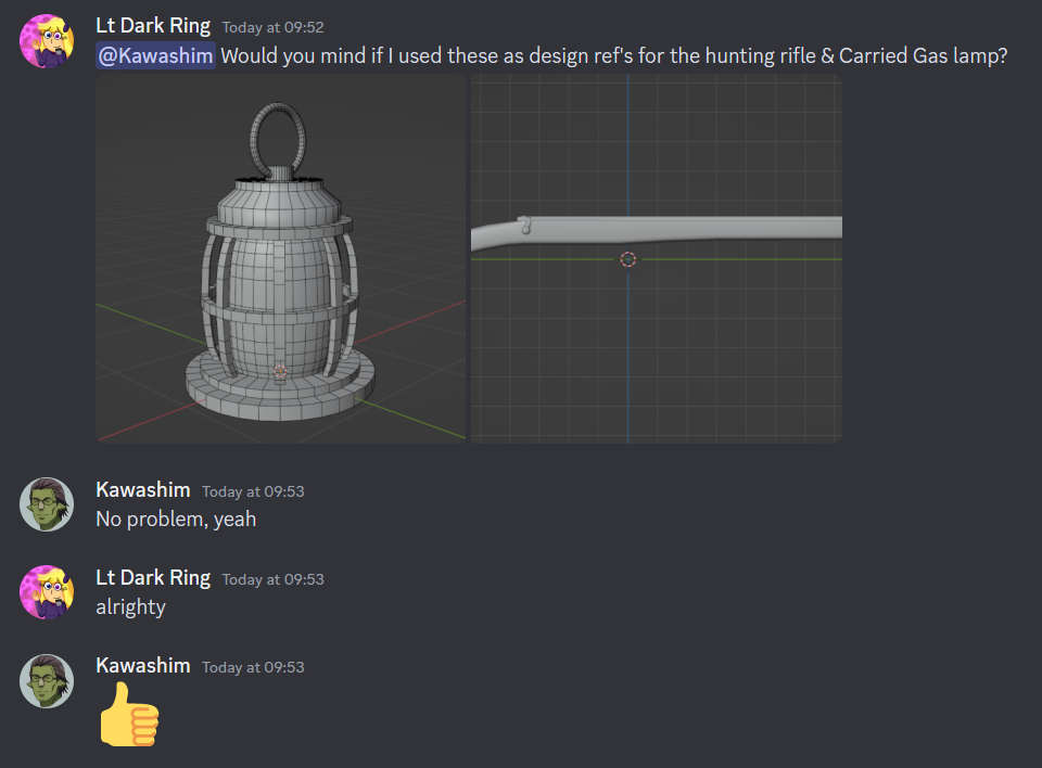
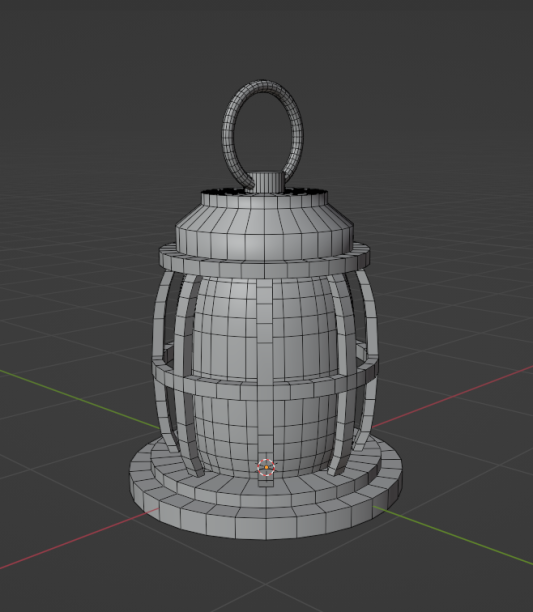
I asked them if I could use the image as a reference for the hunting rifle sprite image, along with the screenshot they had provided for the in progress model of the lamp, and they seemed to be perfectly fine with it in response.
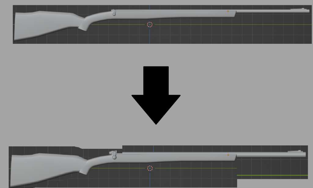
With my references in hand, work swiftly began for the hunting rifle sprite. First, much like what was done with the reference for the axe sprite, the existing reference image was modified in terms of its proportions slightly to give it a slight cartoon like look to it.
One more, 2 versions of the asset would be created. A standard version, alongside a variation of it with mild changes to its design and colour pallet to give it a different appearance, though I did experiment with the hunting rifles variant a little more, in giving it a lever action as a opposed to just a standard trigger.
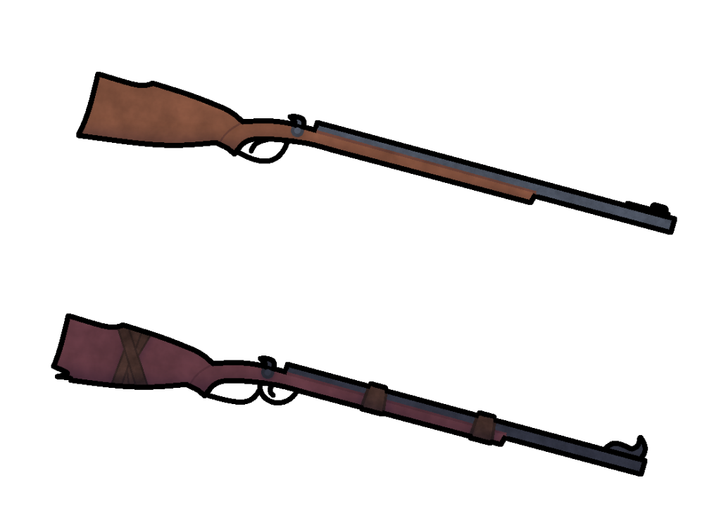
When handed over to the team for the usual review, they described each of the designs as “consistent”, which made me feel confident in knowing that I was start to nail down the design choices that the team were looking for.
Week 2
This week continued with the designing of sprites for the game. Whilst it was taking a bit longer than initially anticipated, progress was still going strong, and I was happy with the results that I was conjuring up for the team to use.
Moving onto the next asset in line, would be the carried gas lamp. The reference for this image would also be of a work in progress screenshot of the provided model, which in a sense, made making the base design much easier, since I knew exactly what to work with.
The way this object would be designed would be handled in a manner similar to the design for each of the individual bullets in the ammunition asset, in drawing half of the sprite on one side, and then duplicating it to match the other side without any issues. Then once more, the base design, along with its altered variant were then created.
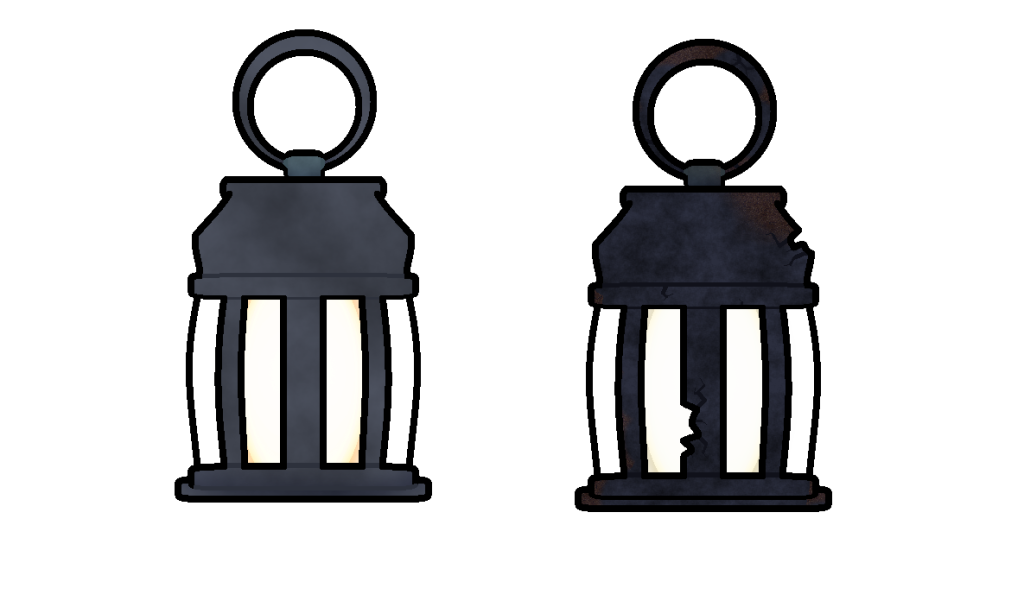
For the lamps altered variant, I decided to give it a more weathered and rusted appearance, as if it had been left out for far too long, and as a result, nature had taken its toll on the object, both rusting it, as well as partially damaging it in several areas. The colour scheme was also made much darker for the lamp in general, as was the overall texture for its withered appearance.
The next assets that came up on the list, were coal, and charcoal. These two did end up stumping me a little bit, especially since when searching up reference images for both of these items, the images provided looked to be almost exactly the same, just with minor differences.
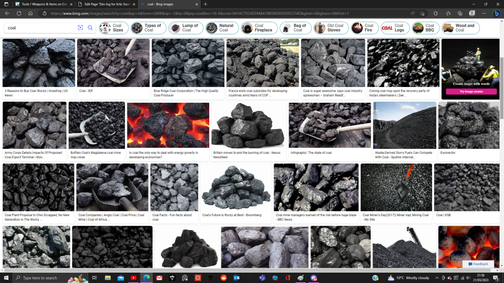
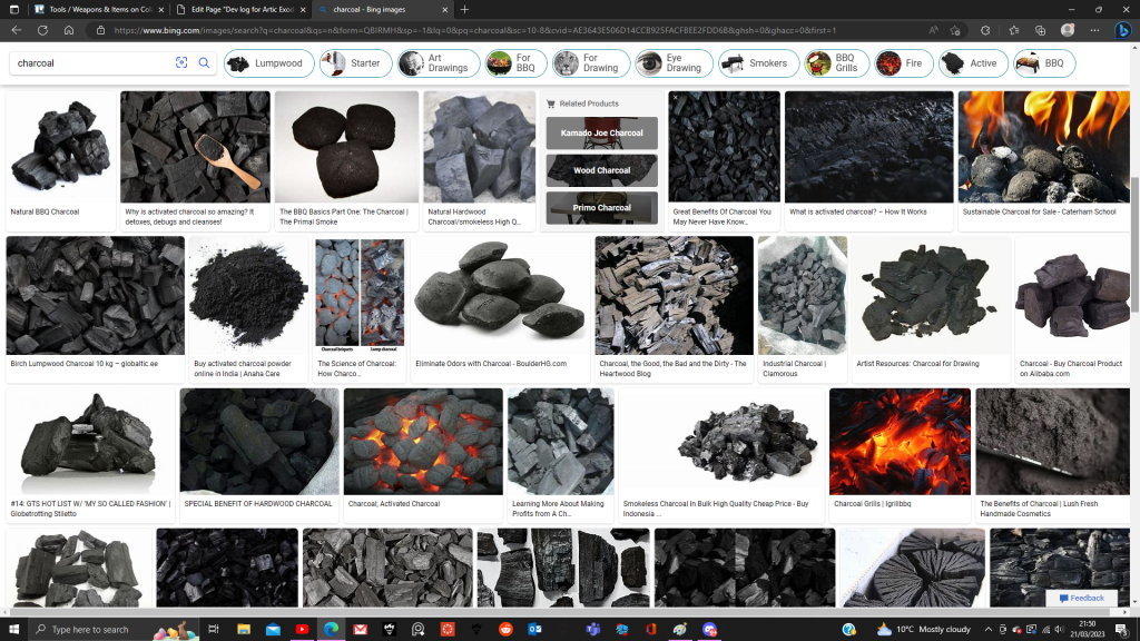
Because of this, I did have to innovate a little bit when it came to designing these assets, since whilst many sources of media (including popular games like minecraft for example) do depict them with very similar designs, but with enough distinctions as to make it easy to tell the two apart, and I hoped my designs would accomplish the same thing, but I did find a way to save time, whilst also making the designs distinctive from one another.
First, 3 rock like shapes were drawn as a base for the coal asset. Then these 3 base shapes would be flipped upside down, and then drawn over with altered designs to represent roughly the same rock shapes but in a different way for the charcoal asset.
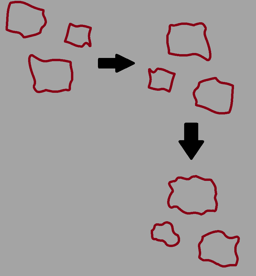
Then, each design would share a rock design from one another to add some mild consistency between the two, before the piles would be assembled to create the designs for both the charcoal and coal assets.
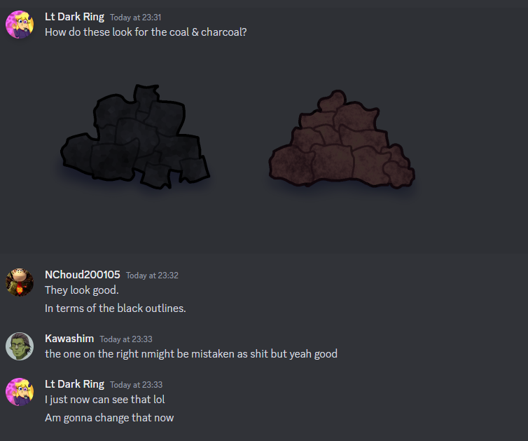
When both of the designs were initially handed in, the coal design was accepted, but the right one was criticised for looking a bit too similar to… well… fecal matter, to put it lightly.
With that comment, the charcoal design was taken back almost instantly and alterations were made to give it a distinction away from that kind of, design.
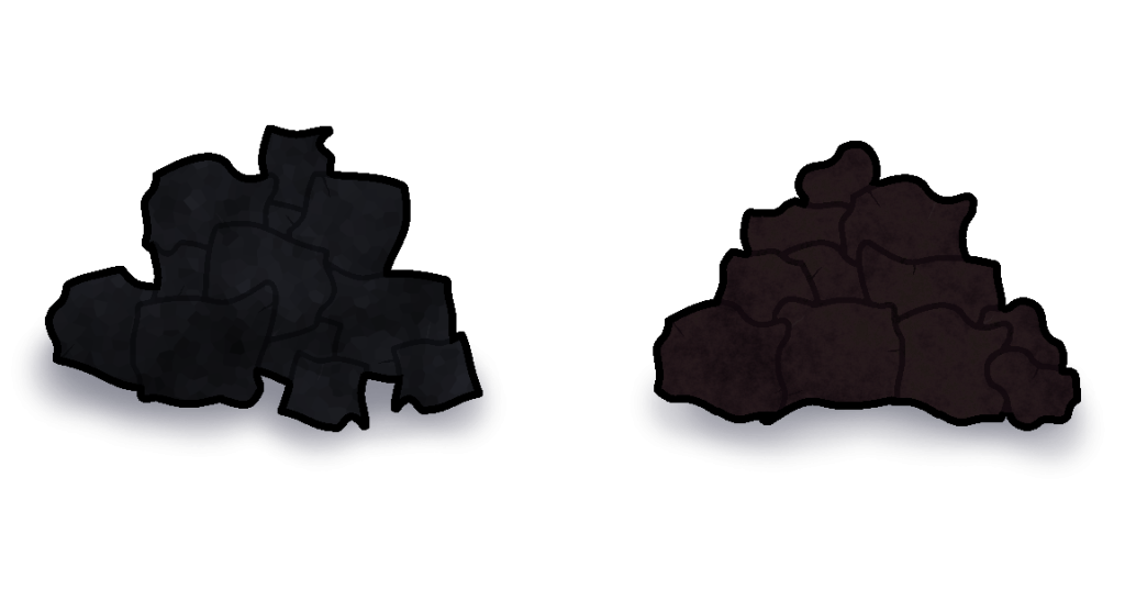
Eventually, after a few minutes of tweaking, the colour pallet was changed, and a few minor details were added to give it a more rock like appearance, in hopes that it does not look like how the team described it as earlier. This did end up sacrificing a bit of clarity between the 2 sprites in terms of colour pallet, but if it meant not getting charcoal confused for feces then I’m all for it.
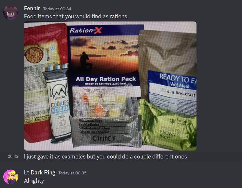
With that incident now resolved, I could now move onto the next asset that needed to be designed, being of rations (things like canned food, bags, etc). I decided to go with 3 items to represent the rations, being of a canned food item, a bag, and a water bottle.
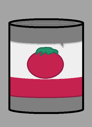
For the canned food, I chose a simple design of canned tomatoes, using a circle tool to make the base, and then adding all of the details inside. A copy of the outline was also created just in case if I changed my mind, or if the team requested a different design.
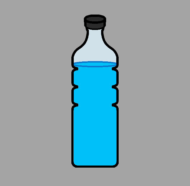
The water bottled would be handled in a similar fashion to the ammunition asset, where half of it would be drawn, then copied and then pasted onto the other side to make it look natural.
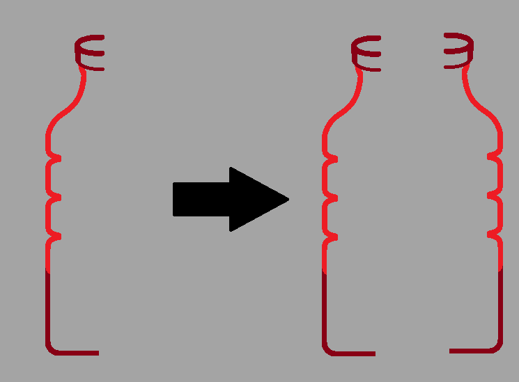
The extra details would then added to the asset (such at the water inside, the lines on the lid, etc, until the base design was completed.
When it came to the branded bag, I was uncertain as to what exactly draw, since when searching up for a reference image of said object, I ended up with results mostly pushing towards designer bags of all thing.
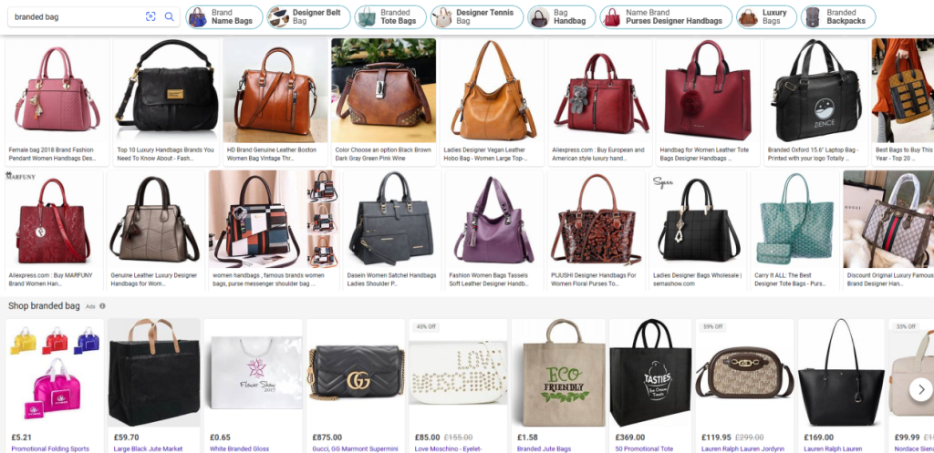
Confused by this, I took to the team, and asked them for clarification and assistance with this query. I was shortly met with this response.
With the adequate references in hand, I took the image, and conjured up a design in terms of a branded bag ration.
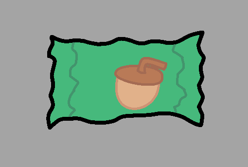
I wasn’t going with anything specific in terms of branding, I just thought of something random just to place onto the packet to make it fit. The details would then be added and then shaded accordingly to fit with the rest of the designs accordingly, and were then sent of to the team for analysis.

The team were quick to respond in terms of the designs, particularly the inconsistency with the water bottle, in how it appeared rounded at the top, yet rather flat around the bottom. The top of the can asset was also criticised for the top of the can not having enough distinction between the top and the sides.
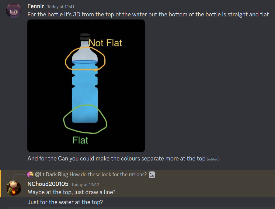
These concerns were then addressed, and then sent back to the team once more for feedback.
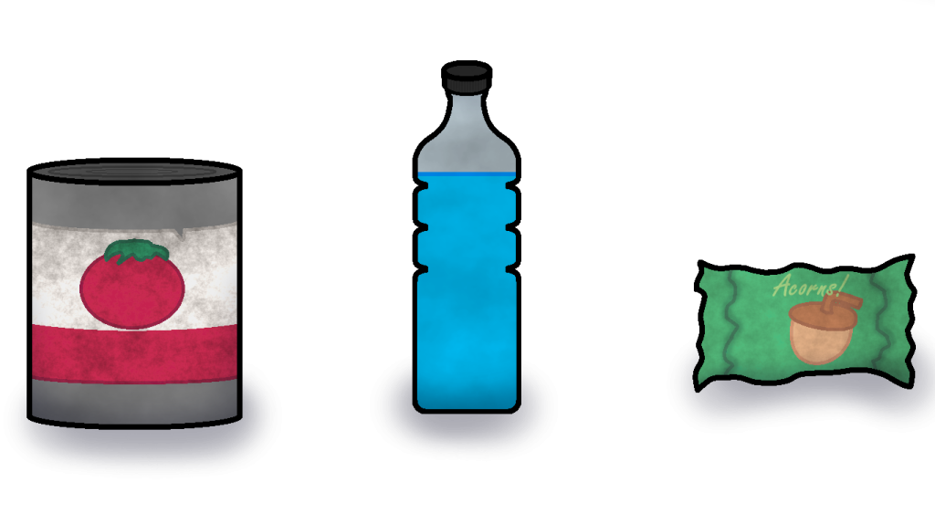
With the designs handed back in, the team were much happier with the designs
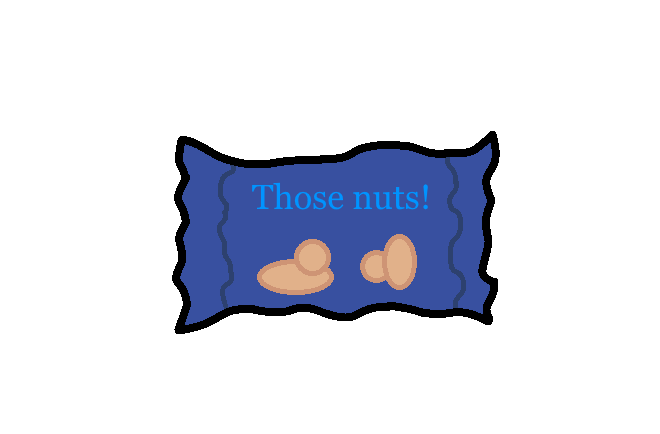
There is actually a variation of the wrapped up asset on the far left that was scrapped due to the joke it was referring to, being deemed too childish, especially for the kind of game that was being developed.
The asset in question would’ve originally been based around the joke “deez nuts”, a well known online joke that is shared around on social media, with the asset being labelled as “those nuts” in reference to it.
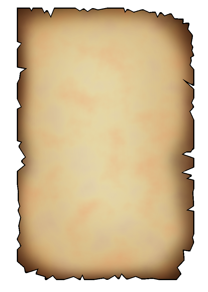
Around this time, I would also finally receive clarification on the scroll paper asset that was mentioned in the list earlier. They would describe the specific design their asking for as follows.
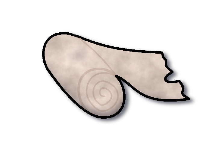
Now that I knew exactly what needed to be done for the scroll paper asset (which actually turned out to be a lot simpler than I initially expected. I got straight to work on the asset itself.
I’d start off the design by using the square tool to create a rectangle shape to represent a sheet of paper, then added various small imperfections all around it to give it that withered and deteriorated look.
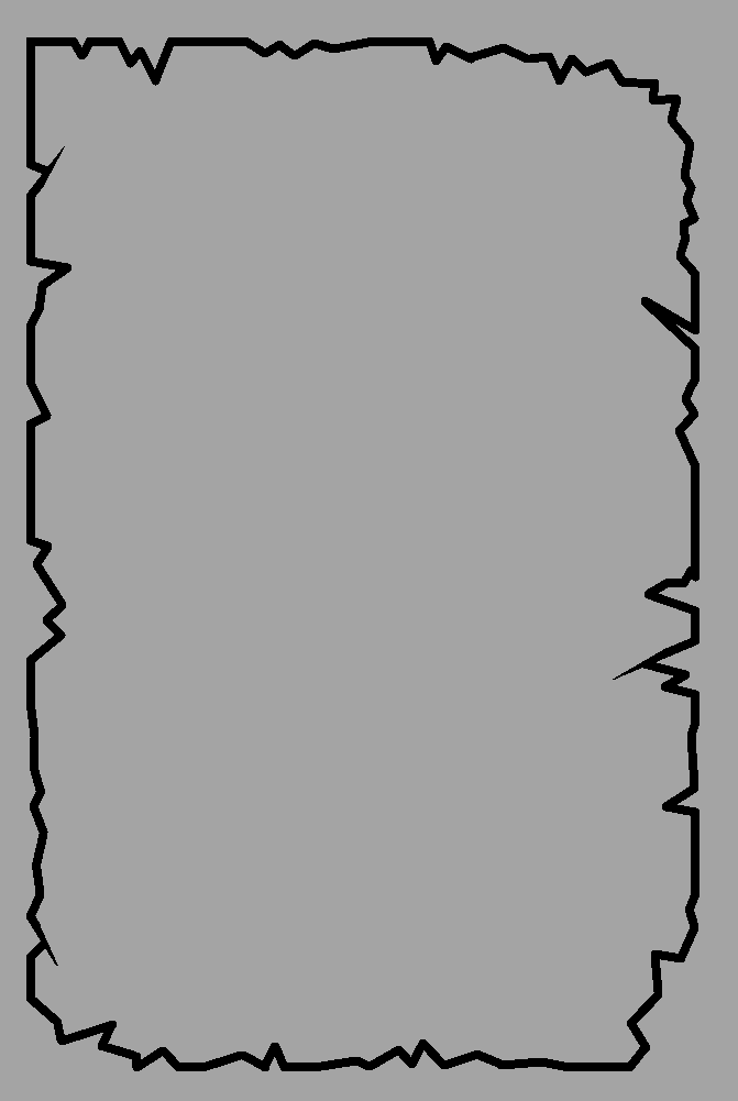
I then sent what I had so far to the team as to give a quick check to ensure it was destroyed enough to make it seem old, but not too destroyed as so that they could easily put text onto it for the merchant character they plan on implementing into the game. I was met with this response.
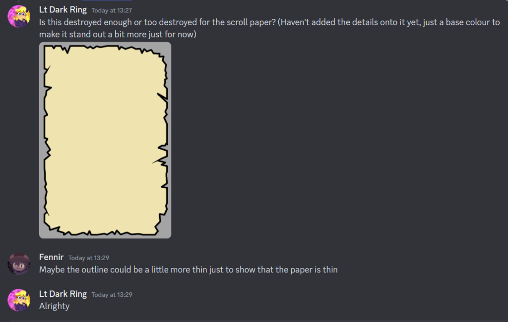
The team had requested for the outline around the paper to be thinner, as to show the paper being a relatively thin object. This was an easy fix that was applied with little issue.
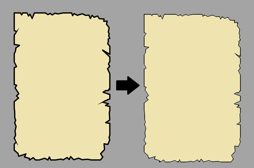
With the line art now at the desired thickness, the extra details were applied, including a layer that gave the edges of the paper a more worn look, as well as one that made the paper overall look generally aged and tattered.
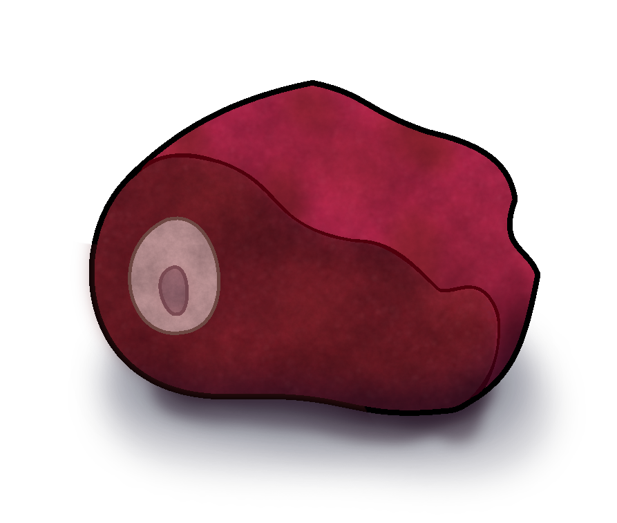
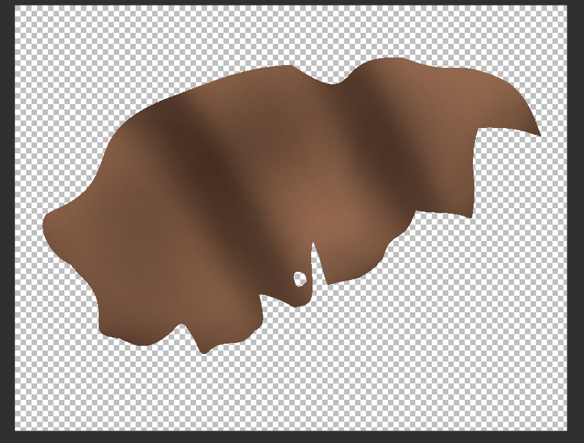
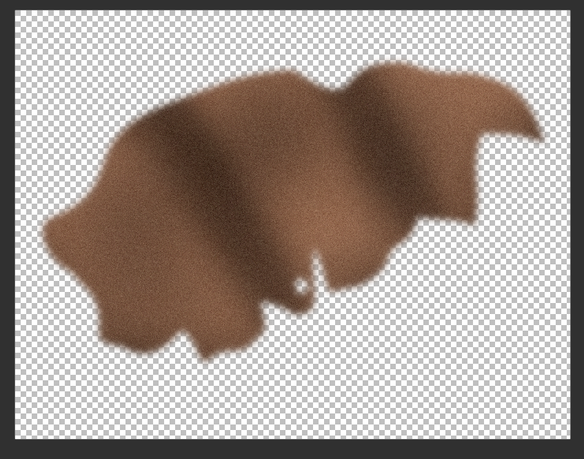
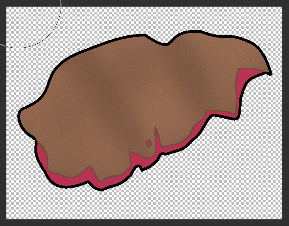
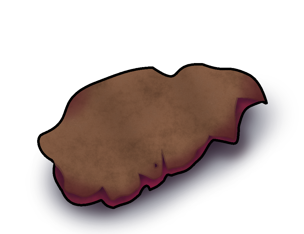
The next asset to be drawn on the list would be items from hunted animals (things like meat, pelts, etc). The reference images when searching for deer meat, offered many different unique variations and angles, though ultimately, I chose a rather simple image to use as a reference for the deer meat asset.
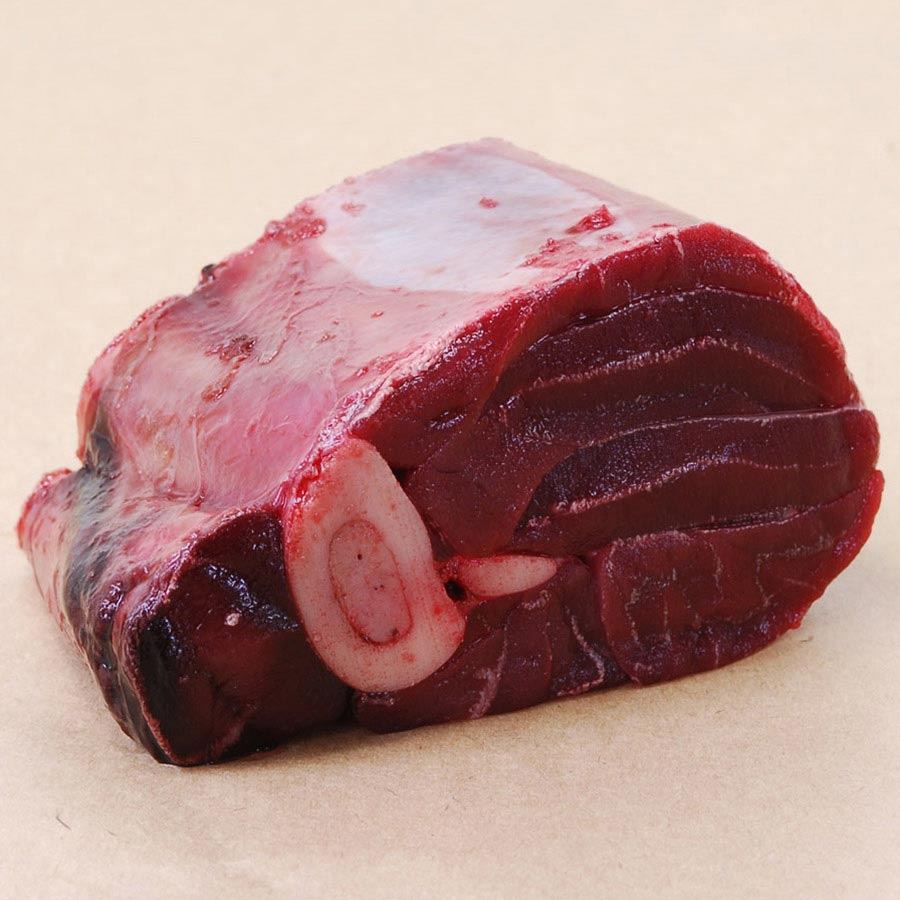
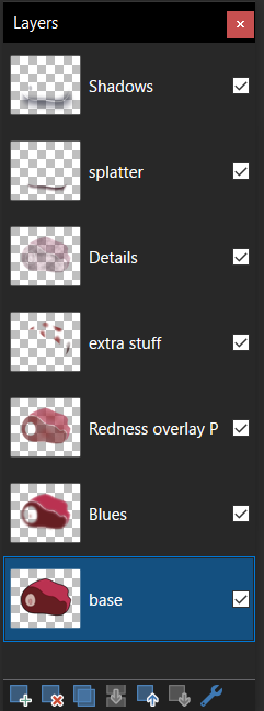
This object would be rather complex in how it is, and required the most layers out of any object in order to get its final design, requiring a grand total of 7 individual layers just to get the object looking the way I wanted to in the end.
With the deer meat done, it was now time to add in the asset for pelts (basically animal skin). Since many of the reference images shown to me involved the animal skin having some level of fur on them, I did however, have an idea from one of my personal works that I could use as a direct reference point in order to fix this problem.
First, the design had to be done into multiple different parts, the fur that would go on top, and the skin that would be underneath and would be barely visible.
Both sides would then be coloured, overlaid, and then minor adjustments would be made to tidy up the overall design of the pelt.
Now for the process in creating its fur effect. This comes back to one of my personal works where I decided to draw a character which had fur over their body (being Benjamin from Bloons td battles 6). The process involved several steps in order to make a fur-like effect on the object of desire.
First, the usual shading on the object would be done as normal, but on a separate layer, since we’ll need the base layer for later use.
Next, this layer will be blurred, and then noise will be added on top of it, giving it a bit of extra texture.
Then, this layer is placed on top of the base layer, the excess is then removed where parts poke out, and then the opacity of this layer is reduced as to allow it to blend in with the base layer, and give it the fur like effect.
Its admittedly not the most convincing looking fur, but with the tools that I have access to, its the best that I am able to manage with.
Then the rest of the details would then be applied to the asset as normal, to give its detailed appearance, and then was promptly sent off to the team for feedback to see if anything needed to be changed.
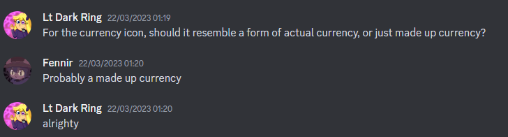
The next asset that would be worked on, would be the currency asset. A few days prior to the creation of this asset, I asked the team if the asset should resemble actual real world currency, or should be its own made up currency. This was the response I was given upon asking.
With the confirmation that the team preferred a made up currency rather than existing ones, I took a look at all of the current real world currency’s, as to ensure that the design I would come up with, wouldn’t look too similar to any of them.
I decided to go for a decagon shape for the currency, as to give it a bit of a distinction from usual currency’s, with Bc being written inside the coin using the “Calisto MT” font to give it a distinctive look. As for what the Bc inside the coin stands for. I couldn’t think of anything that would fit, and so for now decided to just go with a placeholder name “Bronze Coin”
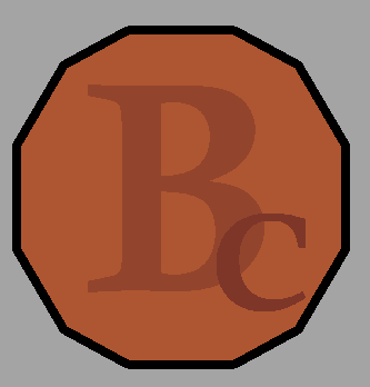
With the base design ready to go, I gave the currency its further details, as well as giving it a unique shine and coin like appearance, before sending it off to the team.
Week 3
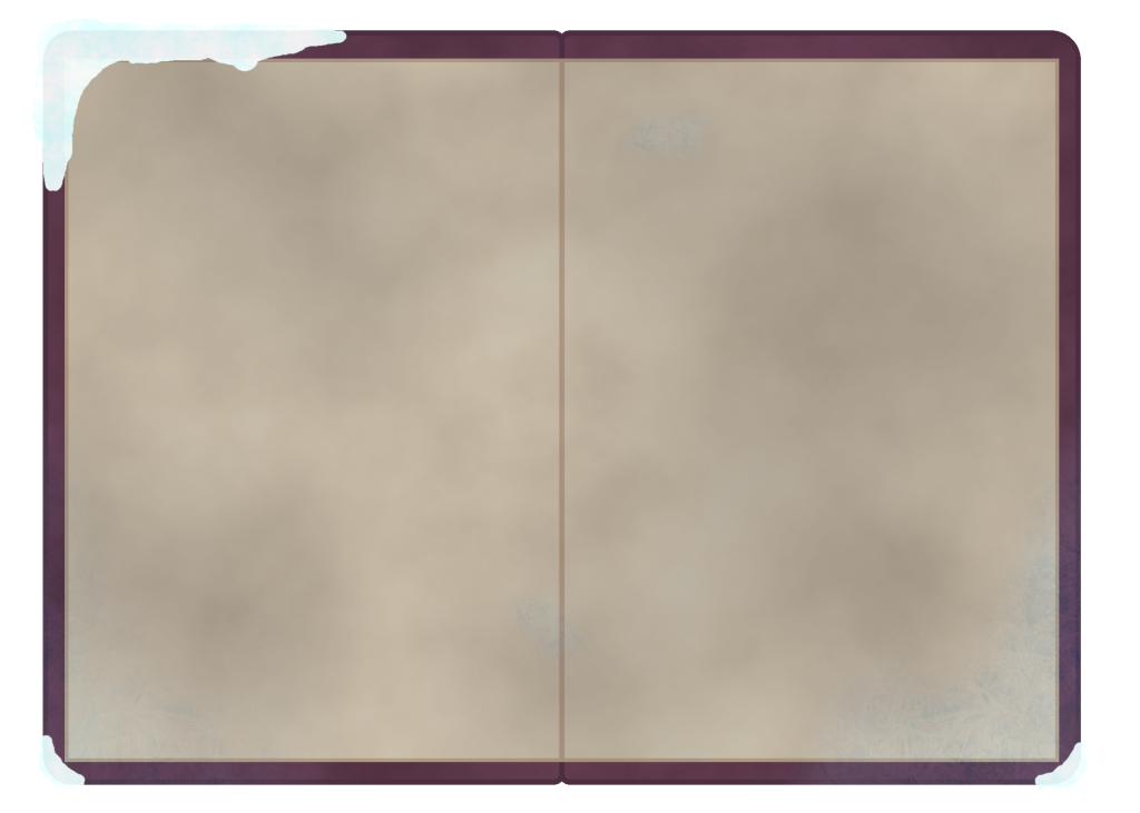
The final asset that was done in terms of the high priority list, would be of the diary, specifically when it was open. Since I already had a base design of the diary within the version that has it closed, it wouldn’t be too much issue to reuse parts of it in the design that has it open.
The design was first initially created using 2 copies of the base template for the book, flipping one to make it look opened, before inserting 2 rectangles to represent the paper inside the book.
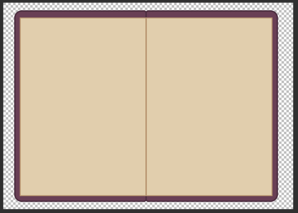
The various details ere then added to the book, including giving the pages inside both a cold and aged like appearance, using the cloud tool one more to add in that withered look, and adding in a subtle blue tint to the pages.
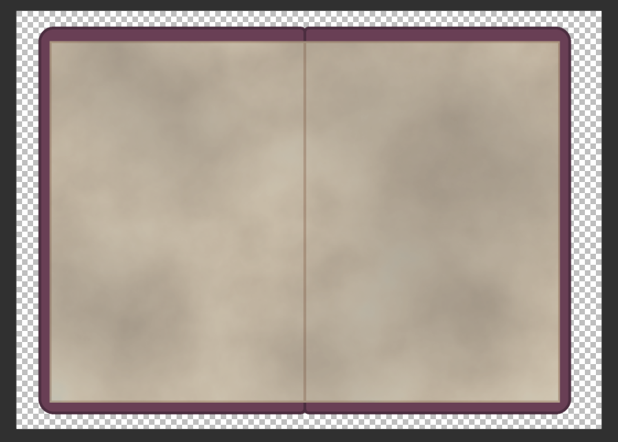
Lastly, the frosty like details were added to the edges of the book just like the version where it is closed, giving it the look that it was left out in the cold before the player would eventually find it. This finalised design would then be send over to the team for feedback.
With this asset handed in, that would now make all of the high priority assets for the game complete.
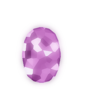
Now some of the lower priority assets could be work on, now that all of the essential ones were handed in. The first of these would be of various different types of gem stones.
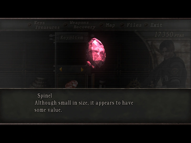
I decided to go for several different types in general, not only because it would help me explore various designs, but also because I knew a good game to reference off that also has a treasure hunting aspect involving several types of gemstones, that being Resident Evil 4.

This would become apparent from as the start of the first gemstone design, which would be based off Resident Evil 4’s Spinel gemstone. A base design of the gemstone would be drawn first, making it in half before mirroring it to make the full gemstone. The outline here is noticeably smaller, since the object in question is much smaller in size in comparison to the sprites drawn previously.
Then came its gem like effect. This would be handled in a similar fashion to how the details were created for the various sprites earlier within this mentioned document, in using the cloud effect. The layer with the given effect would then be enlarged slightly, before I would use a crystalize effect, which gives the inside of the gemstone a crystal like nature (hence the name). Then, several chunks of the now crystallised effect would be copied into another layer and given a glow effect (the base crystalized layer would also get a glow effect, but it would not be as prominent as the one with the selected chunks. This would give the first gemstone a really nice shine that I wish to replicate on the other gemstone designs. A purple less saturated variation of the gemstone would also be created as a test to see how it would look.
I decided to halt with the rest of the gemstones for now and move onto working on the shop menu UI. From the trello board, a rough mock up concept was made for me to follow.
This mock up concept consisted of several items the player could select from on the left, with a sketch of what I presumed to be the owner of the shop on the right.
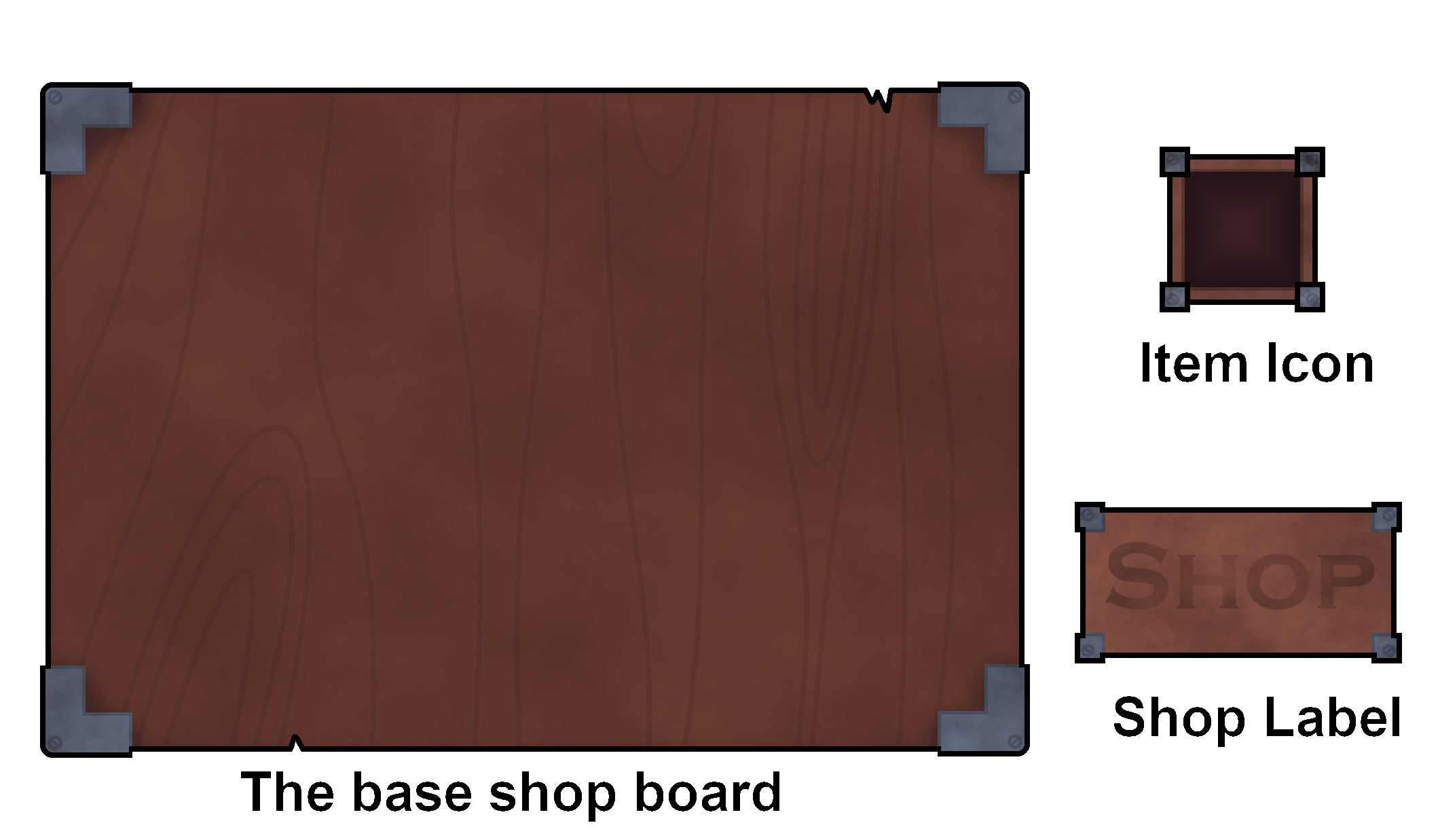
Since the UI looks to compose of many different parts, I decided to draw each of them separately as to ensure that they can be rearranged in flexible way’s, should either the team or myself prefer a different layout.
I first made up a large board that everything would be laid on top of. I decided to go for 2 different theme’s, though I scrapped the second theme early on in favour of a more formal theme, but with hints of the materials used being mildly damaged.
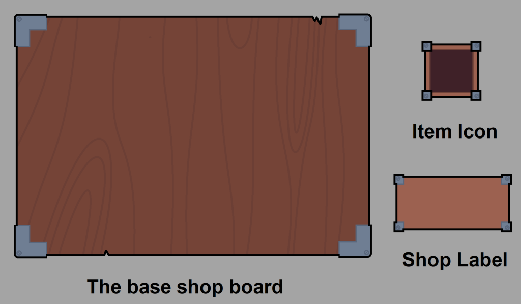
The item icon’s were made relatively small, as to ensure that multiple items could be displayed simultaneously. The icon for where the presumed owner of the shop had not been made yet, since I wanted to get the teams feedback on what I had so far before making the last part.
Then, each of the pieces were given their respective details and then a mock up concept would be generated, one with all of the pieces separate, and one where all of the pieces made so far would be put together in a rough mock up of what the shop would look like.
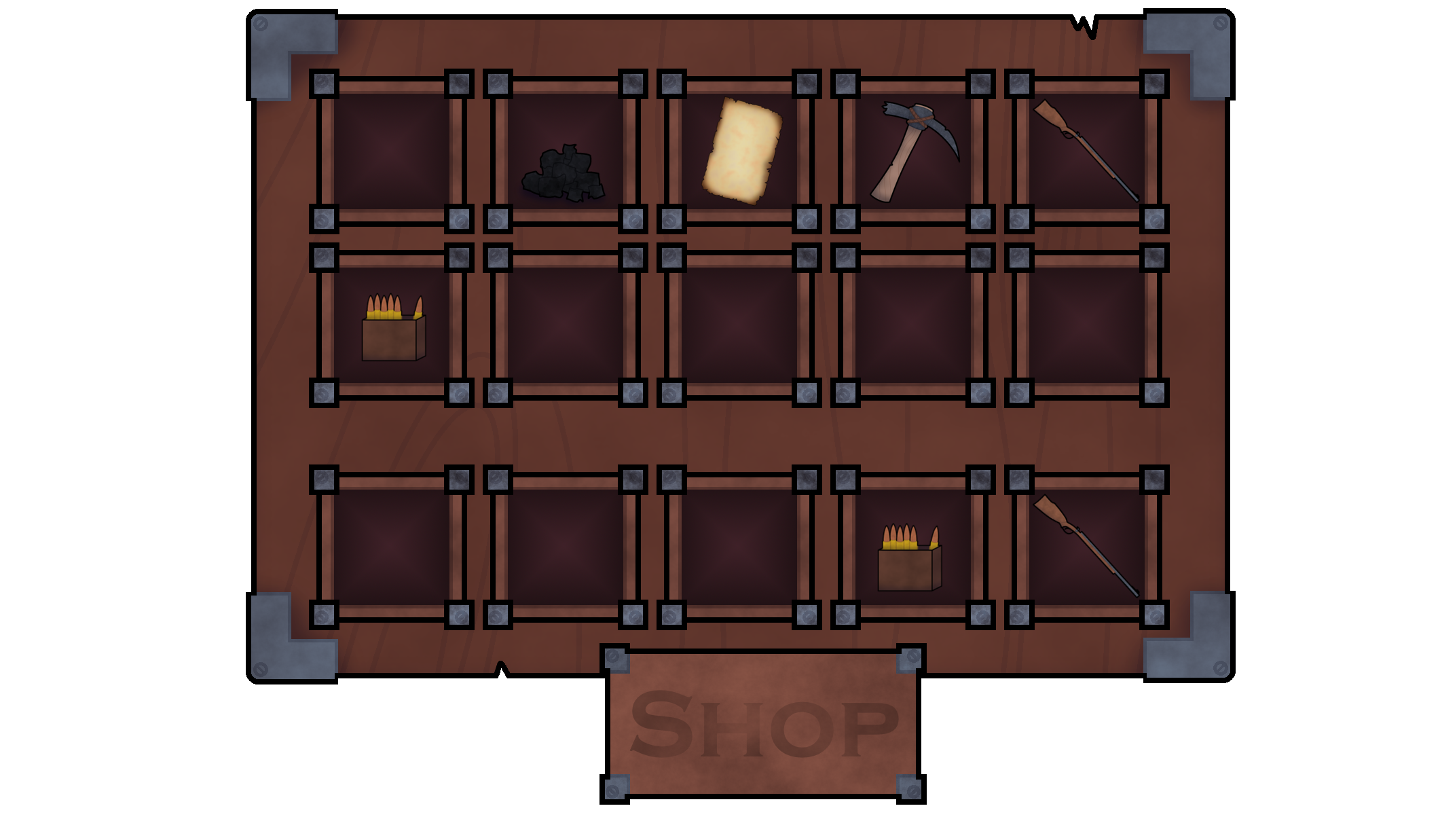
Both of these would then be sent over to the team for analysis.
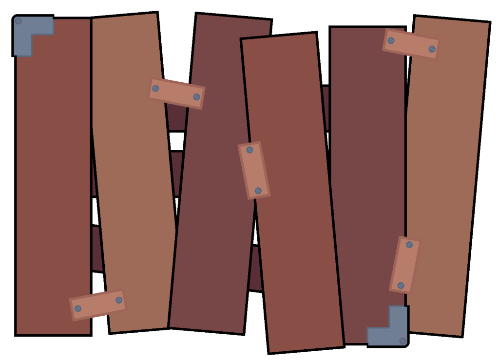
There is an additional design for the base shop board, though I decided to scrap it, since it didn’t look like it would fit with the rest of the games design, that and I believed the team would have difficulty in making use out it (in trying to align the graphics up).
Week 4
Progress on week 4 was slowed heavily by not only a cold, but an unexpected guest under the fridge (not exactly a happy April fools after all), but eventually after getting over it, work continued on as normal, albeit at a slightly slower pace.
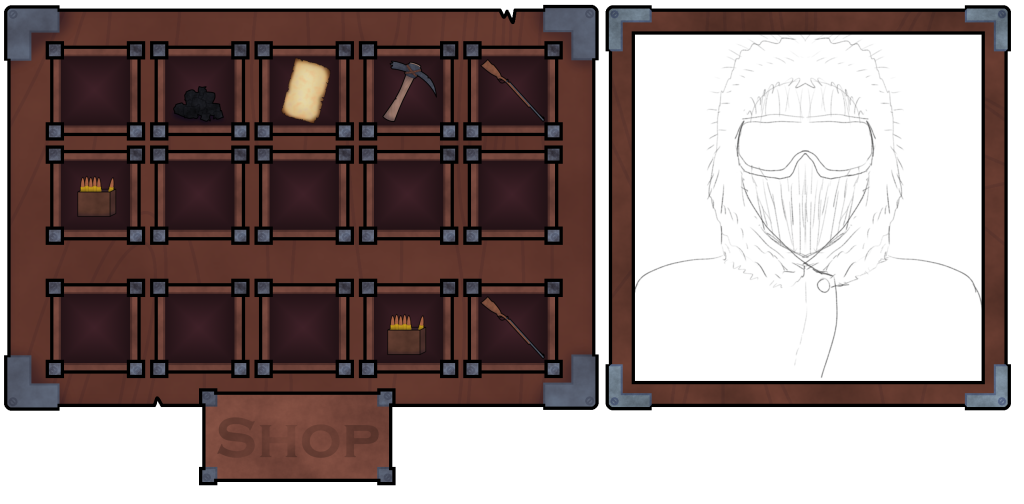
Work began on the last piece of the shop UI, basically where the shop keeper would go. This would use the exact same colour pallet as the shop board, but with a much thinner base similar to each of the item icons. I took the image of the initial drawn concept art of what I presumed to be the owner of the shop as a mock up concept of the near complete thing.
With another one of the higher priority tasks done, I decided that it would now be a good time to have a break for myself over the Easter, and take some time to relax and collect my thoughts.
Week 6
After taking a break for myself during the Easter holidays, it was now time to get back to work for the rest of the assets.
I decided to continue with the work on the low priority assets list, as so that it can be done and moved on from (since that was already started on weeks prior so it only makes sense to finish what was already started).
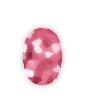
I initially took back to the gemstone design. I decided to create 2 more colour variations of the gem stone, being of a green and blue variant, which was then sent alongside the purple and standard red variant for the team for analysis. At the time, I wasn’t sure at all if the team wanted different designs for each of the gemstones or would settle for the same design but in different colours, so I sent over what I current had, and awaited for their response.
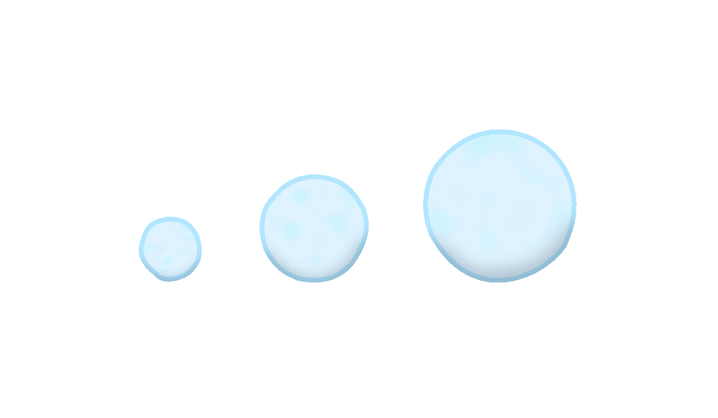
Whilst I waited, I chose to knock out another one of the easy to do assets on my list, being of the snowball. I say this one was easy, since I had actually made snow balls in the past in my own personal works, so I figured it wouldn’t hurt to borrow from my own personal works.
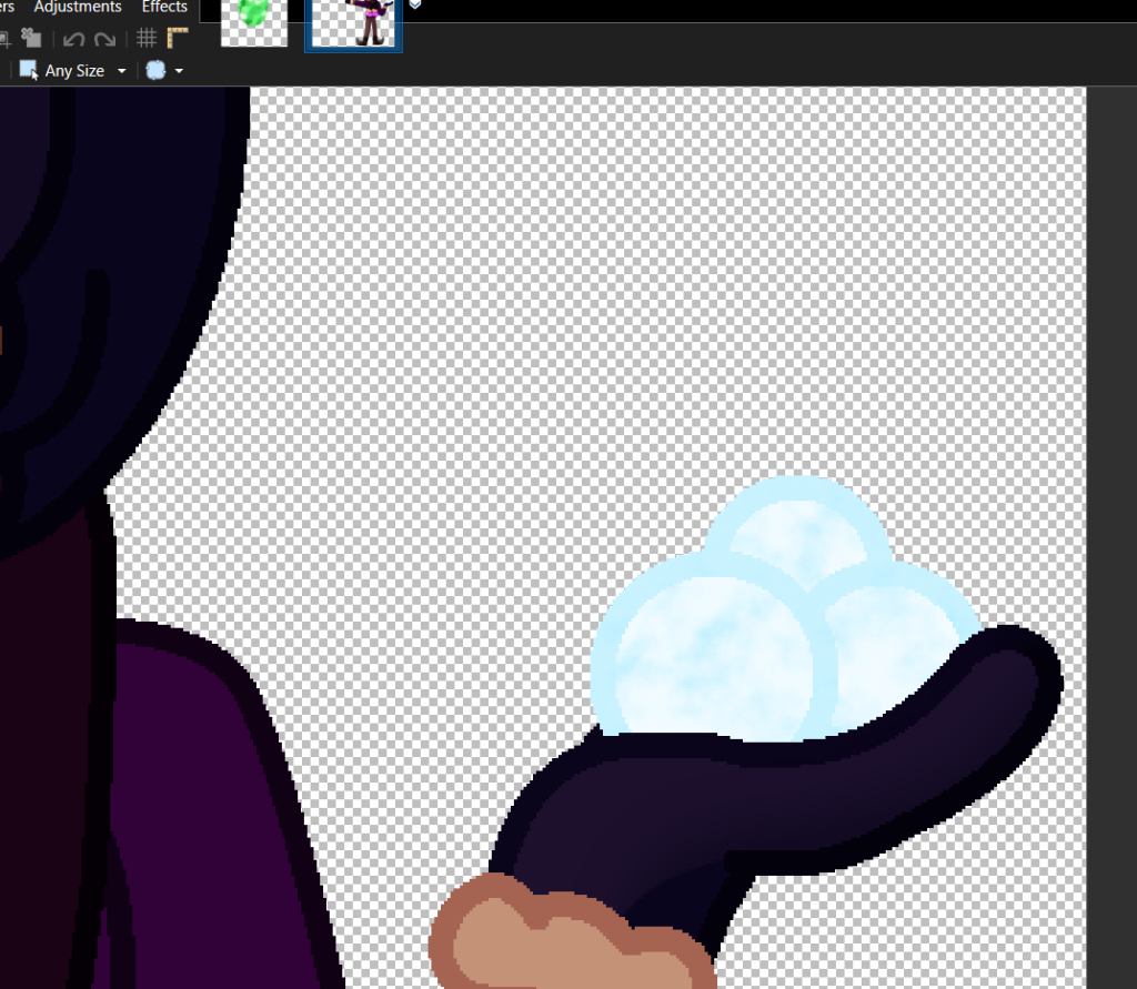
I took a reference image from one of my personal works, and built up designs for various different sizes from there.
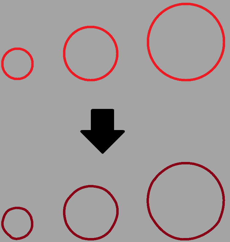
I decided to give the snowballs slight deviations in terms of their circular like appearance (since snow balls aren’t perfect sphere’s at all, no matter how many times some one rolls it in their hands), which is especially apparent on the smaller sizes. The largest size still has a few mild deviations but they are no where as noticeable as the smaller ones.
I then got to work on adding in the base colours, and then adding in all the extra details via various layers (one was used as a noise layer with a blue tint, another layer was used with the cloud render on the centre of the snowball itself, and one final layer was used for the shading on each of the snow balls.
Shortly after handing in the snowballs for analysis, the team responded for the crystals, stating as quote:
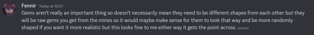
They also responded with the snowballs, though they were unsure as to why those were even on the list at all to begin with, seeing as they would likely never be used. I still chose to do them anyway, since I figured it be better to have the asset for just in case if we do decide to implement them anyway.
Before I continued work on any of the other assets, I asked the team if it would be worth continuing going through the list, or if effort was better placed elsewhere. I was soon met with this response, stating as quote:
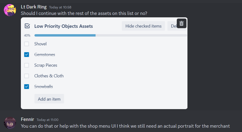
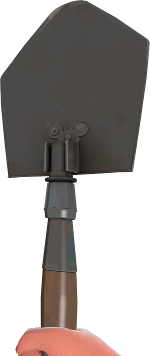
Knowing this, I decided to continue with the low priority asset object list, and make haste for the shovel asset.
For this asset, I would make a copy of the axe asset’s stick, modify it to fit the shovel’s design, and then go from there to design the shovel itself.
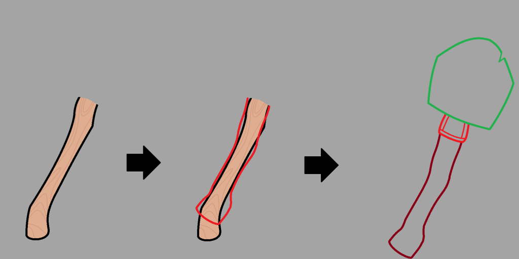
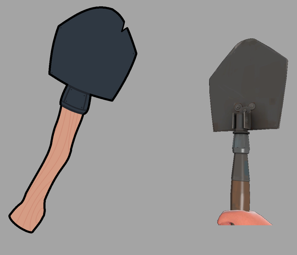
The top of the shovel would have a design similar to how the shovel from Team fortress 2 looks, except having a more simplified look, darker colour pallet, and that there is a slight chip in the shovel.
Before adding in the various details for the asset, I decided to show the team what I had so far for it. I was swiftly met with responses saying that the design was good, and that the extra details can swiftly be added for it, which I went and did in the same format that I did most of the assets for.
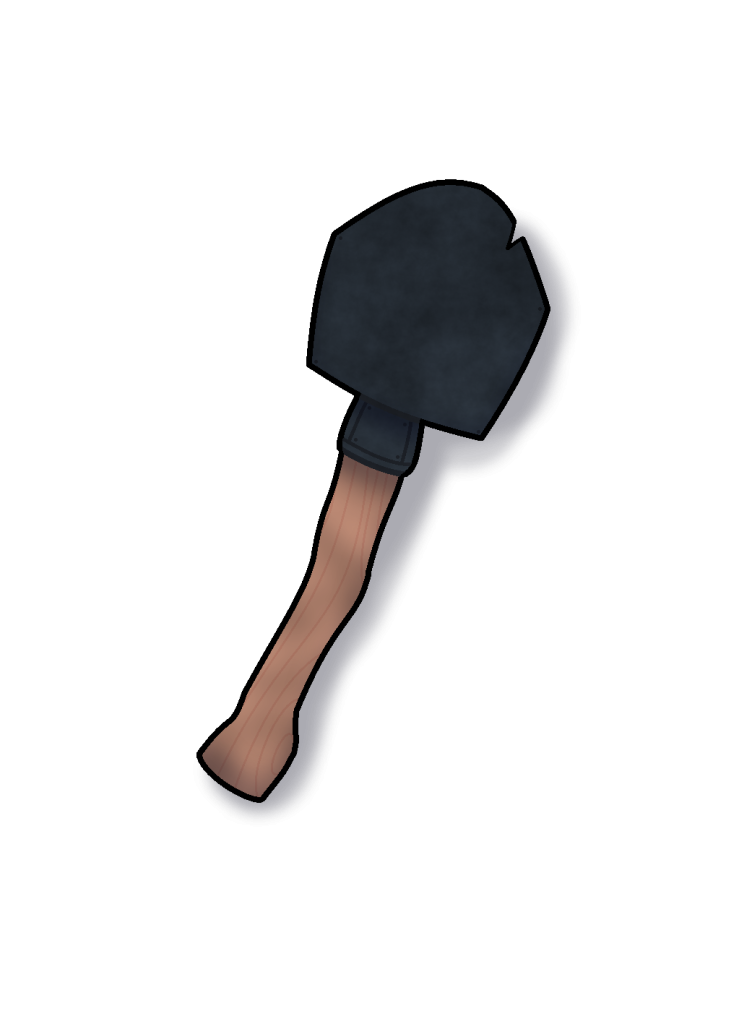
After completing the design, it was sent over to the team for analysis, which they swiftly approved the shovels design.
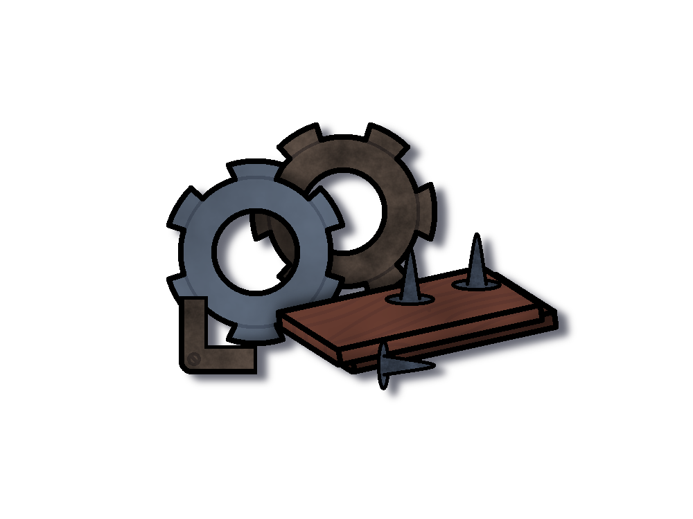
Now that the shovel was done, I got to work on the scrap asset. This one would be similar to the coal/charcoal asset, in many different parts being thrown together, rather than one object being drawn.
This would be done as such by drawing 5 different objects that would represent the pile of scrap in question, being of 2 cogs, a plank of wood, a reused part of a corner piece from the item shop (recoloured), and a nail.
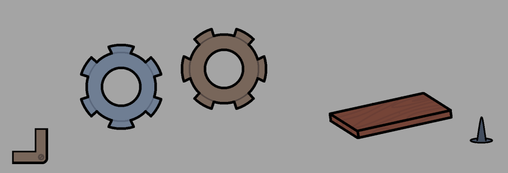
I then would play around with the order of the objects in seeing what I could come up with, before I came up with this design for the pile of scrap.
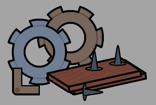
Then came the usual in applying each of the details for the asset, as well as giving it some light shading and a drop shadow to give it a bit of depth.
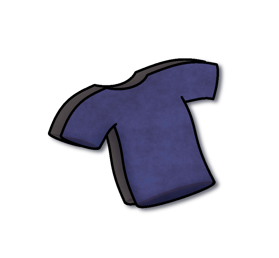
With the scrap out of the way, it was now time for the last asset on the list, being of some clothes/cloth. I decided to treat it similarly to the asset I had just designed, in making multiple separate objects instead of just a singular objects to represent the asset in question (This time being 2 differently coloured T-shirts and a roll of cloth), and then experimented until I got this.
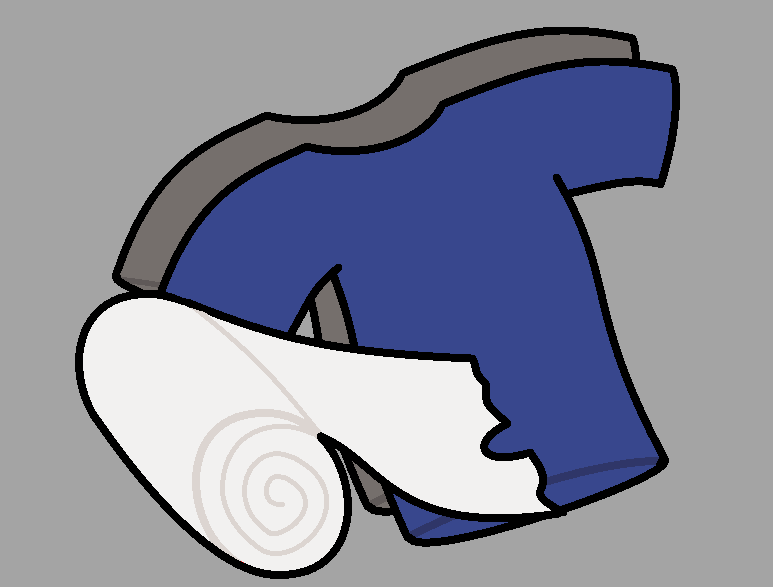
However, I wasn’t sure if it looked good enough, so I sent over what I had so far for the team, and awaited for a response. I was eventually met with this response from the team, where they stated the following:
They wanted both the clothes and the cloth to be separate assets, which I complied and treated them as such. The clothes and the cloth were placed into separate files, and then were given their respective details accordingly. After tinkering aorund with the designs for a bit, these were the results that I got that were then sent off to the team for analysis.
The team accepted the design’s, which allowed me to tick off the last check box for the asset list, rendering it fully complete on the trello board.
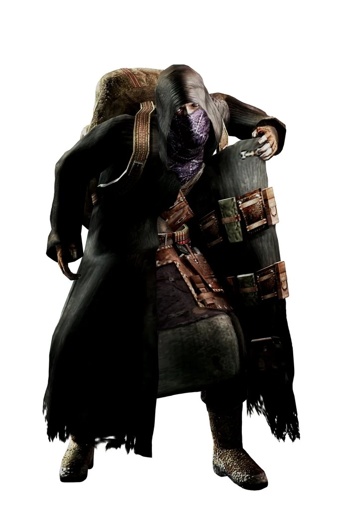
With those assets finally out of the way, I decided to take a shot at designing the merchant that the team had a concept sketch of posted within the trello board.
Given that this character is supposed to represent a merchant that runs a store, I decided to take a similar approach to a design that looks reminiscent to the merchant character from Resident Evil 4, a character who serves almost exactly the same function as the merchant for our game, except in different environments.

Week 7 – Continuing with the Merchant
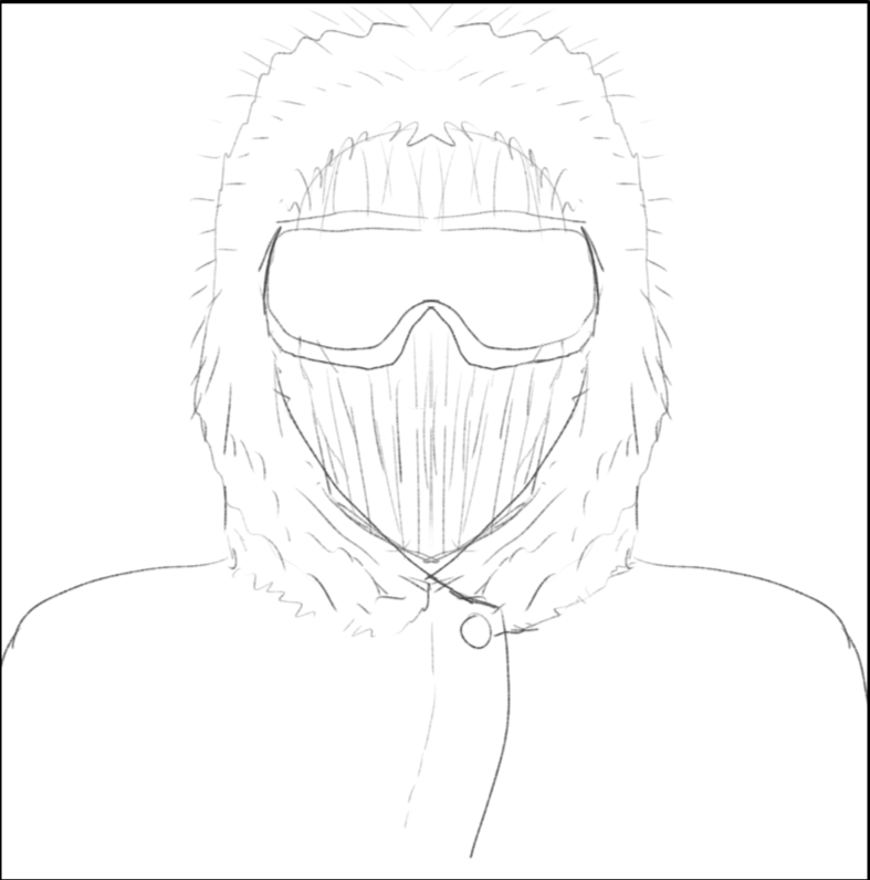
Progress on the merchant character was coming along nice and smoothly, though I did have to innovate on what colour pallet to use since the initial sketch given did not have any colour on it at all. I did eventually come up with 2 different designs, one where the merchant is depicted at a standard size, and one where the merchant was depicted at the standard size shown in the concept art. I was not sure as to which one to go with, so I decided to send both design’s to the team, and await a further response.
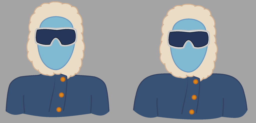
Eventually the team did respond, saying that they were in favour of the wider version, as it quote “represents him better in him being layered up for the harsh weather conditions”. I took this design, and began to add in the extra details for him.
Since the merchant was an actual physical character and not an object, I decided to implement a lot more detail into him since he would be one of the characters that the player would visit on a regular basis. This would be expanded into having layers dedicated to not only the usual like the shading and fur details, but also adding in specific details to represent the detail of fabric, and mild amounts of frost all around his coat to represent the cold weather conditions that the merchant has been in.
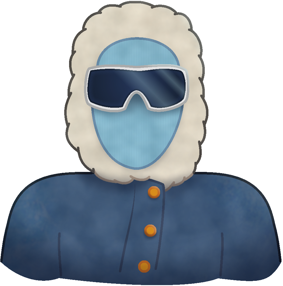
The finalised design only needed a few minor colour tweaks before it would be sent off to the team, which they praised it for greatly (which I am glad they did, since this asset had a lot more effort put into it than the others since it would be a face the player would see on a regular basis, and I wanted to ensure that the player could recognise instantly who it is).
Final week – Test build
During the last few days prior to the assignment deadline, the team handed out a test build for us to play around with the game. I downloaded the test thinking I could give the game a spin, in hopes of providing some last minute feedback before we all turned in our assignment.
With the test build downloaded, I opened the game… only to be met with a problem.
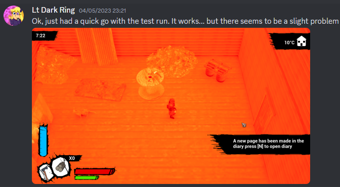
It turns out, the specs of my laptop were not adequate to run the game at all, mainly due to my laptop having a CPU with integrated graphics, which has not been known to work well with Unreal Engine (That and when running the test build, it ran at a maximum of 4 – 5fps, and hogged 30% of the total memory).
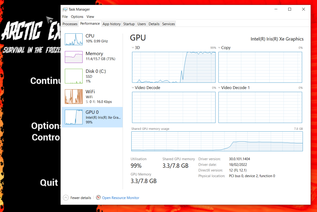
This posed quite the problem, even when playing on my PC (which did fair slightly better with the colours being normal, but the frame rate was still extremely choppy), the game did not run well at all, since I was unable to effectively play the game on either of my machines.
This would mean that I had to effectively go off entirely from the gameplay videos and what others had said, due to both my laptop and PC not being able to properly run the game in a stable state at all.
Though luckily, we did still have 2 members of the team who were able to moderate the test build with mostly green lights (The only main issue from what was said was that optimization was a bit lacking), so they could easily let us know what needed to be changed, ironed out, etc.
Eventually, after a few more days, the final build of the game was released for us to hand in, along with a video explaining the game.
Image references
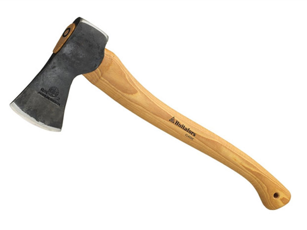
N/A (2017) An image of a hunting axe [Photograph] Available Online: hunting axe – Bing images [Accessed 15/03/2023] Fig.01
N/A (2013) An image of scrollpaper clip art [Photograph] Available Online: scroll paper – Bing images [Accessed 18/03/2023] Fig.02
Kawashim (2023) An image of a work in progress model for the hunting rifle used for the game [Photograph] Available Online: image.png (1355×535) (discordapp.com) [Accessed 20/03/2023]
Kawashim (2023) An image of a work in progress model for the carried gas lamp used for the game [Photograph] Available Online: image.png (533×612) (discordapp.com) [Accessed 20/03/2023]
N/A (2017) Red Deer Meat for sale [Photograph] Available Online: Venison Shank Osso Bucco | Red Deer Meat for Sale (gourmetfoodstore.com) [Accessed 23/03/2023]
Epacha (2010) An image showcasing the Spinel gemstone from Resident Evil 4 [Photograph] Available Online: latest (800×600) (nocookie.net) [Accessed 17/04/2023]
Omolong (2014) An image showcasing the shovel weapon being held from the players perspective from Team fortress 2 [Photograph] Available Online: Shovel_1st_person.png (300×710) (teamfortress.com) [Accessed 17/04/2023]
Play2Often (N/A) An image showcasing the merchant character from Resident Evil 4 [Photograph] Available Online: latest (679×1024) (nocookie.net)
Video references
David Moff (2023) Gameplay and talk through of arctic exodus available online – Gameplay and talk through of arctic exodus – YouTube [Accessed 09/05/2023]